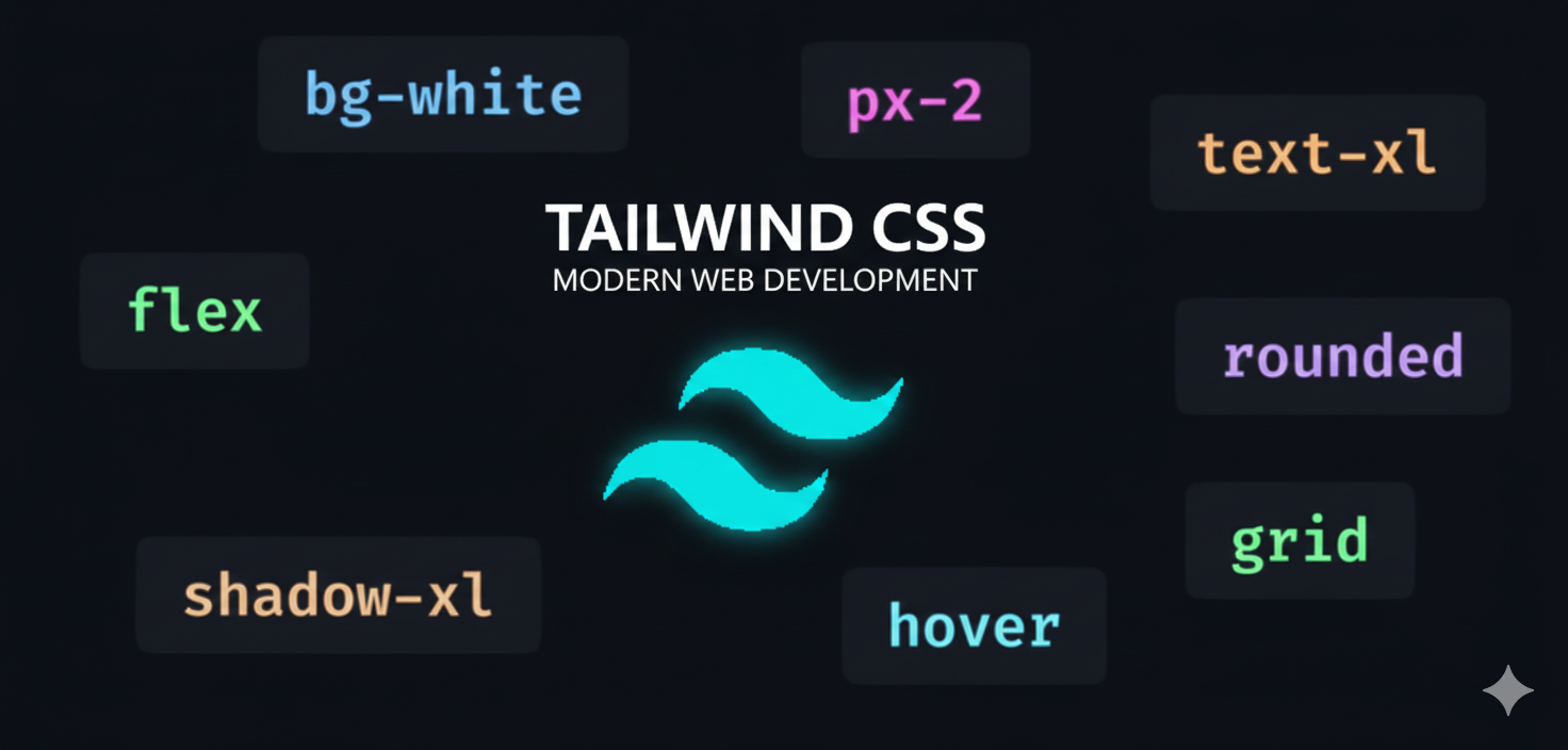
Tailwind CSS Full Course
Contents
Access
Plan

Instructor
Christian John Duque
About this Course
Build stunning, responsive UIs with Tailwind CSS v4. Learn best practices, master utility classes, and deploy your project effortlessly.
# Syllabus
9 itemsIntroduction to Tailwind CSS
Video🚀 Introduction to Tailwind CSS
1.) What is Tailwind CSS? -> Tailwind CSS is not just another styling framework—it's a utility-first ideology that makes building modern, responsive websites faster and easier.
-> Unlike traditional frameworks like Bootstrap or Material UI that come with pre-made components and styles, Tailwind gives you complete control through small, reusable utility classes. Instead of writing custom CSS from scratch, you can simply combine these classes to style your site exactly how you want.
2.) Why Tailwind Transforms CSS Development -> This utility-first approach has completely transformed how developers write CSS. While UI kits are great initially, customizing them to match your specific design can be a headache. Let's be honest: default UI component libraries often feel like fast food menus—they work, but they all look the same.
-> Tailwind, on the other hand, is like a fully-stocked kitchen. It gives you the ingredients, not the pre-packaged meal. No more rigid, cookie-cutter designs. You get the flexibility to customize everything while keeping your codebase clean and maintainable.
3.) The Tailwind Ecosystem -> If you still want to use ready-made components, there's no problem! Tailwind's ecosystem has exploded with component libraries that support it—from Tailwind UI and Headless UI to everyone's favorite, ShadCN UI. These libraries let you build UIs faster than ever without sacrificing customization.
4.) Real-World Adoption -> But do real companies actually use Tailwind? Absolutely! From Upskwela to Facebook, YouTube, Netflix, GitHub, Microsoft, and even NASA—Tailwind CSS is the go-to choice for many large companies. Their official showcase highlights some of the biggest brands using Tailwind CSS in production.
5.) Ready to Begin? -> So, are you ready to take your styling game to the next level? Let's dive right in and master one of the most essential skills in modern web development!
Key Takeaways:
- Tailwind is a utility-first CSS framework, not a component library
- It provides fine-grained control through atomic utility classes
- The framework promotes customization while maintaining clean code
- It has strong real-world adoption across major tech companies
- A rich ecosystem of component libraries complements its core functionality
How does Tailwind work?
TextTo truly understand how Tailwind CSS works, we need to rewind a bit and look at how styling on the web has traditionally been done.
CSS has been around for decades, and for a long time, there was only one widely accepted way to use it: HTML for structure, CSS for design, and JavaScript for behavior. That separation of concerns became almost sacred. For small websites, this approach worked perfectly fine.
But the web didn’t stay small.
Websites became applications. Applications became ecosystems. Stylesheets that once had a few hundred lines exploded into tens of thousands. Suddenly, the “clean” separation that once helped us started slowing us down.
Tailwind CSS exists because of that shift.
This lesson breaks down how Tailwind works, why it works, how it compares to traditional CSS, and why it has become a go-to styling solution for modern frontend development.
The Traditional CSS Mindset
In traditional CSS, styling starts with naming things.
You don’t style an element directly. Instead, you invent a class name that represents what the element is or what role it plays in the layout.
Common examples include class names like container, wrapper, card, hero, section, content, or box. Once the class is named, you jump into a CSS file and define what that class looks like—its width, padding, margin, display type, background color, font size, and more.
This approach feels natural because it reads like English. A card should look like a card. A button-primary should look important.
The problem is that CSS doesn’t understand meaning. It only understands rules. Over time, class names become guesses rather than guarantees.
Two different developers may create two different classes that visually look the same. Even worse, a single class might end up doing too many things at once. A .card class might control layout, color, typography, spacing, shadows, hover effects, and responsiveness all in one place.
At first, this feels organized. Later, it becomes a trap.
The Real Problems with Traditional CSS As projects grow, traditional CSS introduces several recurring problems.
Class Name Fatigue:
-> You constantly have to invent names. Is it card-title, card__title, cardHeading, or
card-header-text? There’s no universal answer, so teams waste time debating
conventions instead of building features.
Tight Coupling: -> A class name often represents both structure and design. If you reuse a class for layout but want different colors, you either override styles or create another nearly identical class. This leads to duplication.
Global Scope Issues: -> CSS is global by default. A small change can break an unrelated page. Over time, developers become afraid to refactor styles because they don’t know who depends on them.
Constant Context Switching: -> You bounce back and forth between HTML and CSS files. Your brain switches context every few minutes, killing momentum and focus.
                                              -> These issues don’t exist because CSS is bad. They exist because CSS was
                                                   never designed for massive, component-based applications.
Frameworks Didn’t Fully Solve the Problem
Before Tailwind, many developers turned to frameworks like Bootstrap, Foundation, or Material UI. These frameworks provided prebuilt components and predefined class names.
They helped—but they also introduced new problems.
You became locked into someone else’s design decisions. Customizing components often meant fighting the framework. Many projects started to look the same. And when you needed something slightly different, you ended up overriding styles or writing custom CSS anyway.
The core issue remained: large, fragile stylesheets were still unavoidable.
The Utility-First Philosophy
Tailwind CSS takes a completely different approach.
Instead of naming components and defining styles later, Tailwind provides atomic utility classes that map directly to individual CSS rules. Each class does exactly one thing—nothing more, nothing less.
A utility class might control display, spacing, color, font size, alignment, or positioning. You combine these utilities directly in your markup to build your design.
At first, this feels backwards. You’re used to clean HTML and messy CSS. Tailwind flips that model: HTML becomes more descriptive, while CSS stays small and controlled.
This is not an accident. It’s a deliberate trade-off.
CSS vs Tailwind: A Conceptual Comparison
With traditional CSS, you think in layers. You design structure first, then styling later. You create class names before you even see the result.
With Tailwind, you think in outcomes. You focus on what you want the element to look like right now. Styles are applied immediately, with instant feedback.
Traditional CSS is declarative but indirect. Tailwind is declarative and direct.
Traditional CSS asks: “What is this element?” Tailwind asks: “How should this element look?”
That difference changes everything.
How Tailwind CSS Is Structured
Tailwind includes a configuration file that defines a full design system. This system includes spacing scales, color palettes, typography sizes, breakpoints, shadows, border radius values, and more.
Instead of choosing random values like 17px or 23px, you choose from a consistent scale. This enforces visual harmony across the application without requiring constant design decisions.
Every utility class maps to a value in this system. When you apply spacing utilities, you select from predefined spacing values. When you apply color utilities, you choose from a curated palette.
This is why Tailwind-based designs tend to look clean and consistent by default.
What Actually Happens Under the Hood
Tailwind is not magic—it’s just CSS, generated intelligently.
During development and build time, Tailwind scans your project files and detects which utility classes you actually use. It then generates only those styles. This process is handled by the Just-In-Time compiler.
The result is a production CSS file that contains exactly what your app needs. No unused styles. No unnecessary bloat.
This is the opposite of traditional CSS frameworks that ship thousands of unused rules “just in case.”
Why Tailwind Is Not Inline Styles
This misconception refuses to die, so it’s important to address it clearly.
Inline styles are applied directly to elements and have serious limitations. They can’t handle hover states, focus states, responsive breakpoints, dark mode, or reuse.
Tailwind utility classes are real CSS classes. They support pseudo-classes, media queries, responsive variants, and reuse across the entire application.
They may look similar at first glance, but architecturally, they are completely different.
State, Interaction, and Variants
One of Tailwind’s strongest features is how it handles state-based styling.
Instead of writing separate CSS selectors, you apply state variants directly alongside your utility classes. Hover effects, focus styles, active states, disabled states, and group interactions follow consistent patterns.
This keeps interaction logic close to the element it affects, making components easier to read and maintain.
Responsive Design the Tailwind Way
Traditional responsive design relies heavily on media queries scattered throughout stylesheets. Over time, this becomes hard to track and reason about.
Tailwind embeds responsiveness directly into utility class names. You define how an element behaves at different screen sizes right where the element is declared.
This creates a clear mental model where all layout behavior is visible in one place.
Component-Based Development and Tailwind
Modern frontend frameworks like React, Vue, and Svelte are component-driven. Tailwind fits naturally into this model.
Instead of relying on massive shared stylesheets, each component carries its own styling logic through utility classes. Components become portable, predictable, and easy to refactor.
When a component changes, its styles change with it—no hidden dependencies.
Maintainability and Refactoring
One of Tailwind’s biggest advantages appears months into a project.
When designs change, you don’t dig through CSS files hoping nothing breaks. You update utility classes directly where they’re used. The impact is localized and predictable.
This makes large-scale refactoring manageable instead of terrifying.
Performance and Production Builds
Because Tailwind generates only the classes you actually use, production CSS files remain small. Smaller files mean faster load times, especially on mobile networks.
This performance benefit compounds as applications grow.
Learning Curve and Mental Shift
Tailwind is not difficult—but it is different.
You must learn utility names. You must think in small styling decisions instead of abstract class names. You must accept denser HTML.
Once that mental shift happens, productivity increases dramatically. Many developers who adopt Tailwind never go back—not because it’s trendy, but because it removes long-standing friction.
Tailwind Respects CSS, Not Replaces It
Tailwind does not replace CSS knowledge. It demands it.
If you don’t understand layout, spacing, positioning, or typography, Tailwind won’t hide those gaps—it will expose them.
Think of Tailwind as a power tool. In skilled hands, it’s incredibly effective. In untrained hands, it feels confusing.
The Bigger Picture
Tailwind CSS works because it aligns with how the web is built today—component-based, fast-moving, design-system-driven, and performance-focused.
It doesn’t fight CSS history. It builds on it.
Once you understand how Tailwind works, styling stops feeling like a separate concern and starts feeling like part of component logic.
That’s the real shift.
And once that clicks, building interfaces becomes less about wrestling with styles and more about delivering real value.
That’s not hype. That’s experience.
Tailwind Fundamentals Understanding the Basics
VideoNew lesson content
The Just-In-Time (JIT) Compiler: Tailwind’s Superpower
VideoNew lesson content
Layouts & Flex-box: Structuring Your UI
VideoNew lesson content
Media Queries & Responsive Design
VideoNew lesson content
Dark Mode in Tailwind
VideoCustom Styles & Reusability
VideoNew lesson content
Tailwind CSS Tips & Tricks
TextNew lesson content
Brought to you by